What Makes a Commercial Look Cinematic? Lighting, Colour Grading and Production Design Explained
Why do some commercials look like beautifully crafted films, while others feel like ordinary video?
It's something we find fascinating at Further Studios. Two commercials can be filmed in similar locations, using similar equipment, yet one immediately feels more cinematic, polished and visually compelling.
The first explanation people often reach for is colour grading. And while colour grading plays an important role, the real answer lies in how lighting, cinematography, production design and colour work together.
Let's explore what makes commercial imagery look exceptional, with five examples that demonstrate these techniques in action.
1. Colour Grading: Creating a Cinematic Look
Colour grading is one of the defining characteristics of high-end commercial video production. It's the process of shaping the colours, contrast and tonal qualities of footage to establish a particular visual aesthetic.
Think of a beautifully filmed commercial featuring warm sunlight, rich amber interiors, deep shadows and natural-looking skin tones.
The image feels luxurious, but nothing looks artificially saturated.
This is what sophisticated colour grading achieves.
What Makes a Great Colour Grade?
- Warm highlights: Golden sunlight and amber tones create a welcoming, cinematic atmosphere.
- Cooler shadows: Subtle blue and teal undertones provide separation and contrast.
- Rich midtones: Carefully controlled colour density gives clothing, furniture and environments greater depth.
- Natural skin tones: Characters remain believable, even within a stylised colour palette.
- Soft highlight roll-off: Bright areas transition smoothly towards white rather than clipping harshly.
One popular technique is the teal and orange look, where warmer highlights contrast with cooler shadows.
However, the most sophisticated commercial grades tend to use this approach subtly, creating visual harmony rather than exaggerated colour separation.
2. Lighting: The Foundation of Cinematic Commercials
While colour grading refines an image, lighting establishes its foundation.
Beautiful cinematography isn't necessarily about making everything brighter. It's about controlling where light falls, where shadows remain and how the viewer's attention moves through a scene.
Example: Moody, Low-Key Lighting

This commercial frame demonstrates how effective low-key lighting can be.
Deep shadows, rich wooden interiors and warm practical lighting create an intimate, atmospheric environment. Rather than illuminating the entire room, the cinematographer allows areas to fall into darkness.
Faces remain readable, while subtle highlights on glassware and surfaces introduce depth.
The warm, dense colour grade enhances the mood without removing the natural contrast.
The lesson: Cinematic lighting isn't about how much light you use. It's about where you place it and what you choose to leave in shadow.
Directional Lighting and Negative Fill
One of the most effective techniques in commercial cinematography is directional lighting.
When light falls predominantly from one side, it creates natural shadows that define facial features, textures and shapes.
Cinematographers also frequently use negative fill, placing dark surfaces near the subject to absorb unwanted reflected light.
This allows shadows to remain rich rather than becoming flat and washed out.
The result is greater depth, dimensionality and a more cinematic image.
3. Production Design: Creating Colour Before the Grade
Here's something that often surprises people: much of what we perceive as beautiful colour grading is actually established before filming begins.
The colours of walls, furniture, clothing and props all influence how the final image feels.
A talented production designer works closely with the cinematographer to create a cohesive visual palette that can then be enhanced during colour grading.
Example: The Golden Kitchen

This scene demonstrates how effective a coordinated colour palette can be.
Warm sunlight illuminates the kitchen, while mustard clothing, golden walls and amber accessories create a beautifully consistent aesthetic.
Rather than relying on strong colour contrast, the image embraces a predominantly golden palette.
The colour grade reinforces these tones while retaining enough contrast and shadow detail to prevent the image from feeling flat.
The lesson: A cinematic look doesn't always require contrasting colours. A carefully designed, predominantly monochromatic palette can be equally powerful.
Why Production Design Matters
A colourist can enhance existing colours, but transforming an incoherent visual environment into something beautifully coordinated is much harder.
That's why location selection, wardrobe and set dressing are essential parts of high-end video production.
The best colour grades enhance an aesthetic already established during filming.
4. Atmospheric Lighting: Creating Depth and Drama
Lighting can do more than illuminate a character. It can become a defining visual element within the composition.
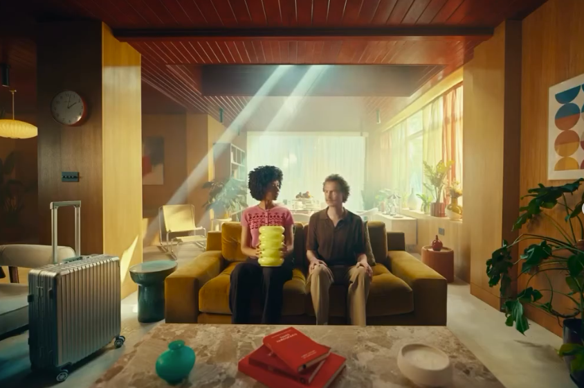
Example: Dramatic Sunlight in a Living Room
This is a striking example of atmospheric cinematography.
Strong diagonal beams of sunlight cut through the room, creating depth and guiding the viewer's attention towards the characters.
The visible light shafts suggest the use of atmospheric haze, which allows the light beams to become visible on camera.
Combined with warm wooden surfaces, mustard furniture and carefully coordinated props, the scene feels almost painterly.
The grade complements the lighting with rich, warm highlights and controlled contrast.
The lesson: When lighting, composition and production design work together, even an ordinary living room can become an extraordinary cinematic environment.
5. Colour Contrast: Making Subjects Stand Out
One of the most effective ways to create beautiful commercial imagery is through deliberate colour separation.
Contrasting warm and cool colours can help distinguish characters from their environments, create visual hierarchy and guide the audience's attention.
Example: The Elegant Restaurant
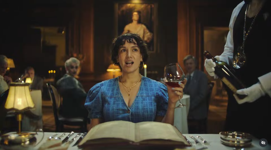
This commercial uses colour contrast exceptionally well.
The environment is dominated by warm amber lighting, dark wooden walls and rich brown surroundings.
Against this backdrop, the character's blue dress immediately attracts attention.
The cooler wardrobe colour provides separation from the warmer environment, while gentle lighting keeps her face prominent.
Small practical lamps throughout the background create additional depth and atmosphere.
The lesson: Sometimes a carefully chosen wardrobe colour can have more visual impact than an aggressive colour grade.
6. Naturalistic Lighting and Filmic Colour
Not every cinematic commercial relies on dramatic lighting.
Some of the most beautiful images are those that appear completely natural, even though the lighting and colour have been carefully controlled.
Example: Warm, Naturalistic Living Room
This scene combines warm orange curtains, burgundy clothing and soft directional daylight.

The light gently illuminates the character while brighter highlights around her hair help separate her from the background.
The colour grade preserves the rich warmth of the environment without making skin tones look unnaturally orange.
Cooler green tones outside the window provide a subtle contrast to the warm interior.
The lesson: The most sophisticated cinematic imagery often feels effortless because the lighting, production design and colour grading are working in harmony.
7. Camera Choice, Lenses and Film Emulation
Camera technology also plays an important role in creating cinematic footage, but an expensive camera doesn't automatically produce a beautiful image.
Professional cinema cameras from manufacturers such as ARRI, Sony and RED offer extensive dynamic range and colour information, giving cinematographers and colourists greater flexibility.
Recording in suitable LOG or RAW formats helps preserve information for post-production, provided footage is correctly exposed.
Lens selection is equally important.
Some lenses create extremely sharp, clinical images, while others offer softer contrast, distinctive flares and more organic rendering.
The right choice depends on the creative direction.
What Is Film Emulation?
Film emulation is a post-production technique designed to recreate selected visual qualities associated with traditional photographic film.
These can include:
- Film-inspired contrast curves.
- Richer colour density.
- Smooth highlight transitions.
- Subtle grain and texture.
- Softer, more organic tonal characteristics.
Colourists commonly use software such as DaVinci Resolve to develop these looks, sometimes drawing inspiration from traditional film stocks and print processes such as Kodak 2383.
However, a cinematic LUT or film-emulation preset is not a substitute for beautiful cinematography.
The strongest results come when the final grade complements the lighting and production design captured on set.
8. Why Some Commercials Look More Expensive Than Others
A larger production budget doesn't automatically guarantee better-looking footage.
A commercial shot on an expensive cinema camera can still feel visually ordinary if the lighting, wardrobe, location and colour palette haven't been considered together.
Equally, a smaller production can look exceptional when every department works towards a shared creative vision.
The difference is often creative intention.
A carefully chosen location, beautifully motivated lighting and considered production design can elevate an image long before it reaches the colourist.
This is why cinematic video production should be approached as a complete creative process rather than a collection of technical decisions.
9. Our Approach to Cinematic Video Production at Further Studios
At Further Studios, we believe beautiful commercial filmmaking begins with a clear creative vision.
Whether we're developing a brand film, commercial, corporate video or marketing campaign, we consider how every visual element contributes to the story.
That means thinking about lighting, locations, cinematography, production design and colour grading from the earliest stages of development.
How should the film feel?
What emotions should the imagery communicate?
Should the aesthetic feel warm and inviting, bold and contemporary, or refined and understated?
Answering these questions early allows us to develop a cohesive visual direction that carries through production and post-production.
The goal isn't simply to make footage look expensive.
It's to create purposeful, memorable imagery that supports the brand and connects with its audience.
Final Thoughts: Cinematic Quality Is Created, Not Applied
So, what makes a commercial look cinematic?
It's not simply the camera, the lenses or the colour grade.
It's the relationship between them.
Lighting creates depth and atmosphere. Production design establishes visual harmony. Cinematography shapes perspective and composition. Colour grading brings everything together.
When these disciplines are working towards the same vision, the result is imagery that feels rich, natural and beautifully crafted.
And that's what separates ordinary video from exceptional commercial filmmaking.
Looking to Create a Cinematic Brand Film?
At Further Studios, we specialise in creative video production, commercials, brand films and post-production that combine thoughtful storytelling with beautiful visual execution.
Whether you're developing a new campaign or looking to elevate your existing video content, we'd love to explore what we could create together.
Explore Further Studios and get in touch to discuss your next project.
Keep reading